AGRev
— Agricultural Revolution
Crafting experiences for the go-to destination in agricultural equipment.
Lead UX Designer
Figma, UX Research Methods
Nov 2022 - Mar 2023
Alignment across stakeholders
Limited to UX Design & Research
Fast Turnover
Role
Tools
Timeline
Constraints
Overview
When AG Revolution approached Salesforce Statting, the goal was clear: streamline the way discounts were managed in Salesforce Sales CRM and craft a smoother, smarter Marketplace experience—from pre-sale to checkout and beyond.
I partnered closely with the team to optimize their Sales Discount Manager and design a fully responsive, user-friendly Marketplace flow that made both internal teams and customers breathe a little easier. Complex flows, meet clean solutions—with a side of collaboration and a few cups of coffee.
What did I do?
— Strategy & Discovery
Developed a detailed project brief to align on goals, define scope, and set a clear vision for success.
Led market research and competitor analysis, gathering insights from industry leaders and best-in-class marketplace experiences to inform design direction.
— Responsive Marketplace Experience
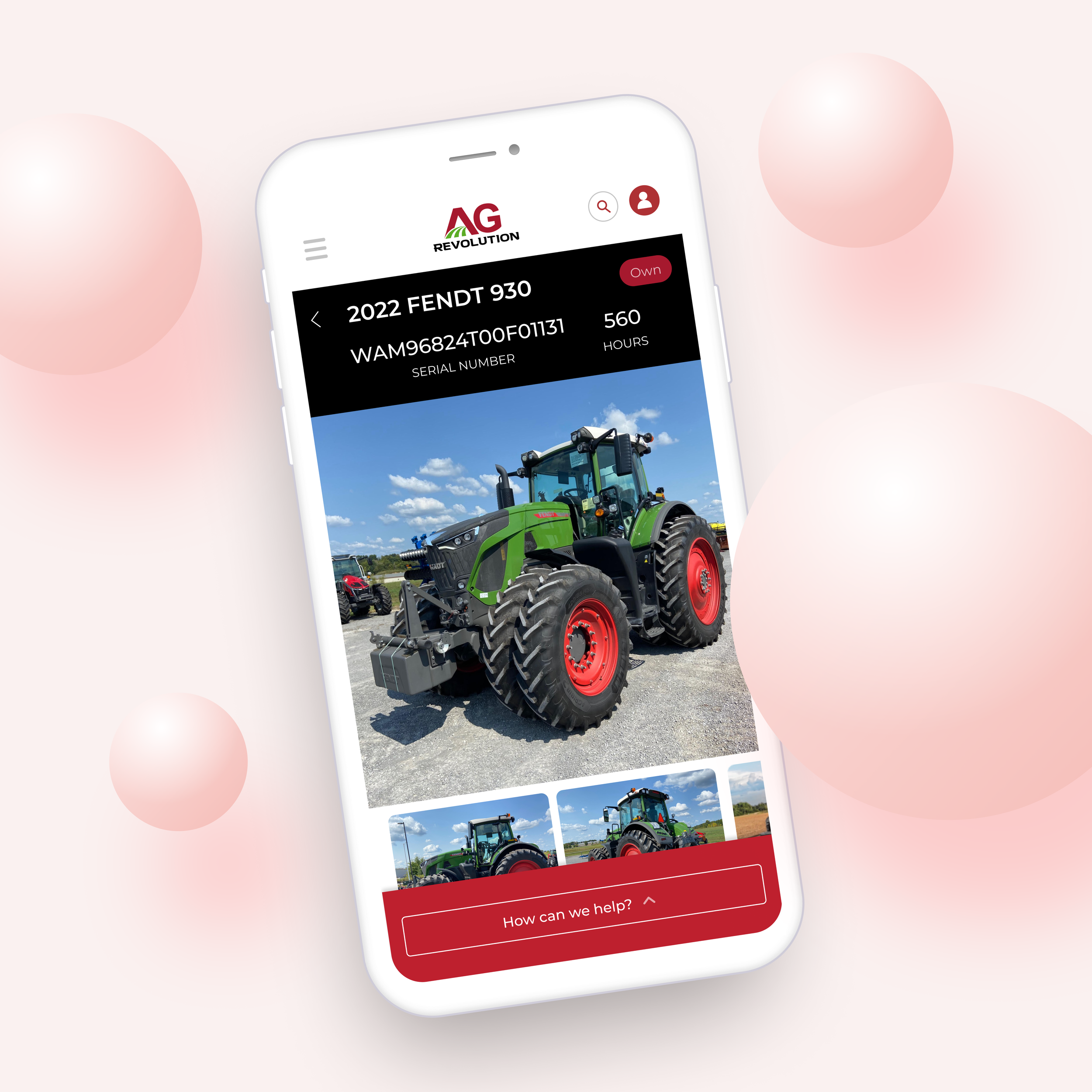
Designed and prototyped the Marketplace experience from scratch for both mobile and desktop, covering the full journey—from pre-sale exploration to checkout and post-sale engagement.
Created interactive mockups to validate and communicate the user flow, enhancing both user experience and stakeholder alignment.
— Visual & Design System
Created a fresh branding system and component library, ensuring consistency, scalability, and ease of use across the product.
Built a reusable design foundation that sped up collaboration and future iterations.
— Product Design & Optimization
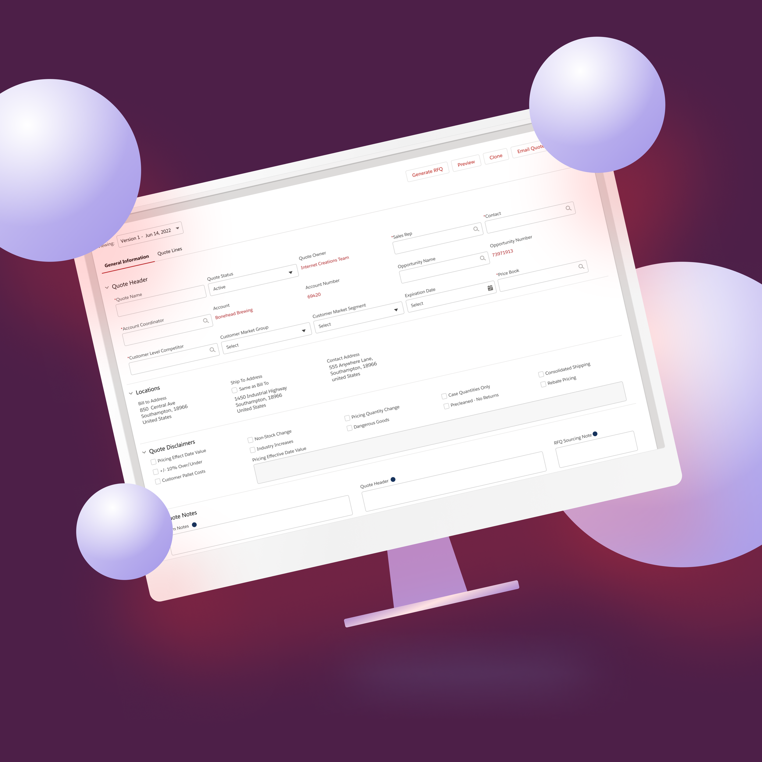
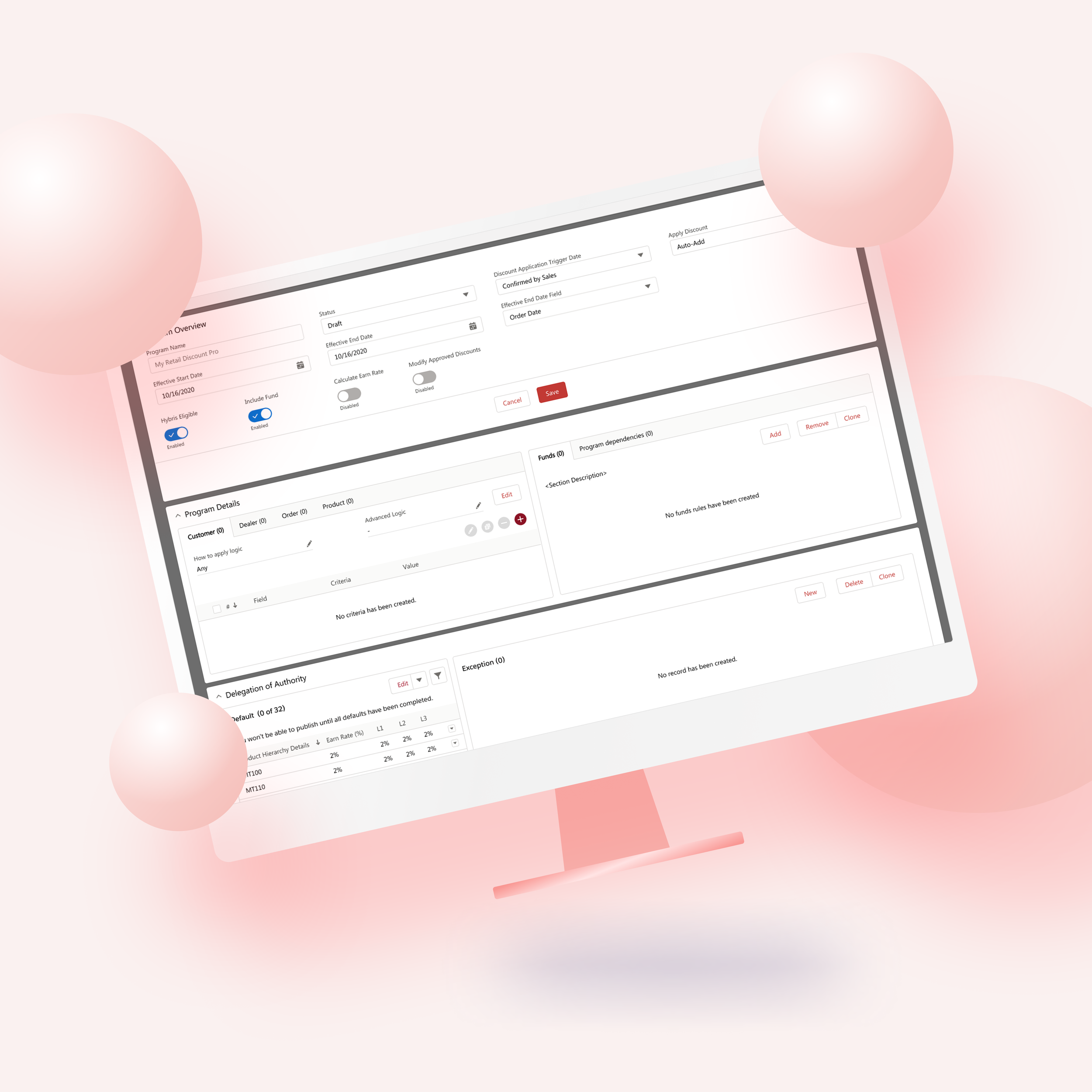
Redesigned the Sales Discount Manager inside Salesforce Sales CRM, simplifying a complex internal workflow into a clear, intuitive experience for the sales team.
The situation
Smoothing Out the Sales Cloud
Refreshing & Optimizing Salesforce Sales Cloud
Their Quote Manager and Discount Program were… let’s say, not the smoothest operators. Clunky, scattered across different areas, and far from intuitive, these tools made it tough to act quickly on time-sensitive offers. The goal? Create a more connected and streamlined experience that sales teams can enjoy, allowing them to move faster.
From Cluttered to Clear
Designing a Homepage That Actually Guides the User
The original homepage? A bit of a visual maze. Lots of content, not a lot of clarity. It looked nice, but it didn’t help users figure out what to do or where to go. I wanted to flip that completely—to create a homepage that didn’t just showcase the brand, but kicked off the user journey with purpose. Think: guidance, excitement, and a clear path to the best agricultural equipment (and a real intro to who they are).
Rethinking Used Equipment
Selling Used Like It's the New New
Let’s be honest—"used" doesn’t always get the spotlight it deserves. But when it comes to agricultural equipment, value matters just as much as shine. We needed to reimagine how used equipment was presented—something more like booking a trip on Airbnb or buying a car from Tesla or Carvana. Clean filters, smart recommendations, financing options, and a sense of trust built right into the experience.
It all starts with
a conversation
The project kicked off with a bit of a design tug-of-war—stakeholders couldn’t quite align on the direction for their website redesign. Everyone had ideas (and lots of competitor tabs open), but no clear path forward.
To bring some clarity to the chaos, I gathered their feedback, inspirations, and expectations into a solid project brief. This included stakeholder insights, direct & indirect competitor comparisons, homepage goals, and best-in-market examples—plus my own analysis to tie it all together. With that in hand, we were ready to hit the ground running (and designing) with confidence.
Want to see the analysis? (Yes, we don’t just make things pretty.. shocker)
Research
— CLIENTS BRAINSTORMING
Direct quotes and feedback from stakeholders likes and dislikes.
— INDIRECT COMPETITOR
— DIRECT COMPETITOR ANALYSIS
— MARKET EXAMPLES
Branding & Component Library
Ideation
& Process
From sketches to real-world impact.
-
After syncing with Anthony (AGRev’s go-to visionary) and aligning with stakeholder goals, the big-picture thinking began. This wasn’t just about a website redesign—it was about creating a reusable marketplace framework that could scale across other brands and future partners.
My brain lit up with questions:
What kinds of experiences do users need?
What does the site map look like?
Which components need to be modular, responsive, or branded differently?
How many interactions and states will we need?
We weren’t just building components—we were crafting a flexible design system that could stretch across both the Salesforce ecosystem and AGRev’s public-facing Marketplace, while still feeling cohesive and easy to scale.
-
Yes, responsive design is UX 101—but making it feel right across mobile, tablet, and desktop? That takes intentionality.
Every journey we designed had to feel intuitive, smooth, and branded no matter where it was viewed. Mobile wasn’t an afterthought—it was a core part of the product experience.
-
Once the mockups were signed off, it was time to spark some excitement. I created interactive prototypes that looked and felt like the real thing—clickable, scrollable, and testable on both desktop and mobile.
Stakeholders got to try it out on their own devices, giving them a hands-on experience of what the final product could actually be. It wasn’t just a design—it was a story they could walk through.
-
And here’s where it got really fun: we took the prototypes and made them part of AGRev’s real-world booth experience.
Live equipment on the floor had QR codes attached, leading directly to their live listing or similar items in the Marketplace. Visitors could explore product info, check pricing and availability, and even walk through the pre-sale and post-sale experience—right there on their phone.
Not only did it engage potential customers, it gave us direct, on-the-spot feedback. The result? A digital product that didn’t just live online—it became part of the physical, real-life sales journey.
Design Prototypes


